
Sharecare
ATLANTA (2010) - As Creative Director for HSWI, I led a team of product managers and UX designers to create the original specifications for the Sharecare platform.
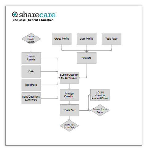
Utilizing Axure RP Pro to create a shared project that could be accessed across product and design teams, I architected the first draft of the entire platform from end user functionality to administrative tools and created the first feature outline and Sitemap to communicate functionality for approval by Sharecare stakeholders.
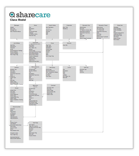
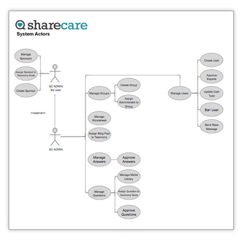
What you see here is a snapshot of my first pass at a Class Model, Actor Definitions, an example Use Case, and an example wire. Axure allowed for fluid interactivity with design docs for interesting contextual workflow... for example, Actor Definitions defined use cases, which could be clicked through to Use Case workflow, which could then be clicked through to the actual page wires. Page wires would then communicate basic interactivity, i.e. hover over states, modal dialogues, and workflow.
Engineering would use my team's deliverables to drive development, data architecture, and communicate accurate timelines.

Several months of tweaking and collaborating with Sharecare executives, Product Teams at Zoco, Editorial Teams, Sharecare Sales and operations allowed time for in depth discovery of business needs across the organization. Our final deck embodied the living system that Sharecare needed to operate and act on its organizational goals and the blueprints to execute. My role throughout the process was to clearly communicate a shared vision across departments through implementation. Sharecare.com launched in October 2010.
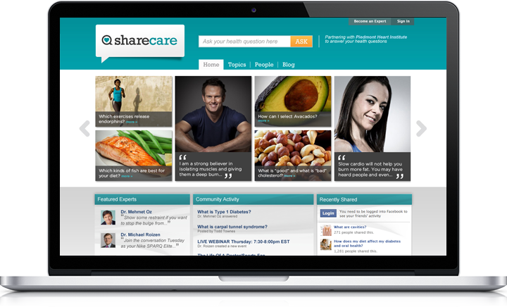
As my group moved into position to develop the brand, I had the pleasure of leading the design effort identifying key drivers and form factors that embodied Sharecare's mission to answer the world's questions of health. Mind mapping exercises and shape decomposition played into a series of iterations until we honed in on the form that met the needs of our stakeholders.
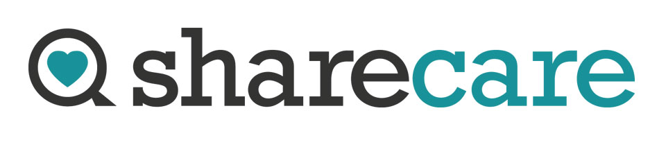
The final version is derived from a Q representing the idea of questions and search as it mirrors the shape of a magnifying glass. A heart in the final version embodied a universal symbol of caring and doubled as a favorites icon throughout the Sharecare site.
Deliverables:
Specifications Document
Wireframes
Click Through
Design Assets
Style Guides
Services:
Information Architecture, UI Design, Interaction Design, Art Direction, Project and Product management